One Page WordPress Themes – October 2013

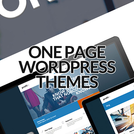
One Page WordPress themes are becoming quite popular lately. Not only do these ultra simplified and straightforward themes look brilliant but they are also faster loading. Some say they also produce higher conversion rates. Here are some of the latest One Page WordPress themes you need to check out:

GoBlack One Page Parallax WordPress Theme

GoBlack Premium WordPress Theme is a clean and modern single-page portfolio styled theme ideal for the promoting services of creatives, design agencies, or creative freelancers in a professional manner. This 100% fully responsive theme was built in HTML5 and CSS3 using Parallax javascript to create the animated parallax image effects that make it engaging and dynamic. GoBlack features include the revolution slider, unique portfolio scroll animation, smooth tabless design, fentancy black color schemes, and so much more.

Prisma One Page Responsive WordPress Theme

Prisma Premium WordPress Theme was developed with a goal to provide a quick solution to create an impressive modern website with an easily editable layout without sacrificing unique aesthetics. This bold, fully responsive one page theme built with Bootstrap 2.3.2 is easy to customize and includes features such as: filterable portfolio with integrated Fancybox, animated retina-ready splash menu, and also single page layout with stand-alone page setup option among others.

Flavor One Page Parallax WordPress Theme

Flavor Premium WordPress Theme is a warm and classic looking one page premium theme that will surely make your portfolio stand out. The generous space dedicated to presenting images (filterable) is readily accessible and gives visitors a very good idea of the quality of your work. Salient features of this theme include: modular homepage – layout sections + layout shortcodes, smooth tabless design, parallax effect, flexible grid system built with Bootstrap, among many.

Webmakers One Page WordPress Theme

Webmakers Premium WordPress Theme is a single page, clean and minimalist style WordPress theme recommended for creatives, freelancers and agencies. This theme comes with 5 pre-made theme skins, powerful theme options with ability to change typography, unlimited style settings for colors, fonts, and other design elements, a custom plugin based shortcode generator to build theme element easily, a built in ajax contact form, to name a few.

Cingle Responsive One Page WordPress Theme

Cingle Premium WordPress Theme is a clean, responsive multi purpose One Page WordPress theme ideal for a range of web uses. This premium theme will work well for business or corporate portfolios, creative agencies, design professionals, or even freelance professionals who want a more flexible theme to meet their various needs. Cingle features an ultra responsive design (enable/disable), sticky navigation, light and dark styles, parallax, Google Analytics tracking code, unlimited theme customization options, etc. to get your website to where you want it to be.

Simple Easy Parallax Retina WordPress Theme

Simple Premium WordPress Theme is an impressive, modern and yet very easy to use flat design WordPress theme with both single page and multiple page layout options. This fully responsive theme inspired by cool metro colors and built with Bootstrap includes features such as: mobile optimized parallax feature, animated contents, retina display optimization, touch optimized responsive layout, filterable expanding portfolio, and fully tested it on iPhone 5, iPad 4, S3 android and Windows Phone.

Visia Responsive One Page Retina WordPress Theme

Visia Premium WordPress Theme is a beautiful, minimalist, fully responsive retina ready single page WordPress theme that will surely impress your visitors. This premium theme includes a separate blog section and is suitable for any kind of creative or business use. Visia is highly optimized for both mobile and desktop platforms and uses a lazy-loading support for images, assets and compression of all required scripts for lightning fast loading time. It also features a built in custom thumbnail cropping tool to help you control images you need to highlight for your posts.

Omni One Page/Multi Page Parallax Flat WordPress Theme

Omni Premium WordPress Theme is a high quality, flat and full responsive WordPress theme for creative businesses or photographers. This Bootstrap built modern theme gives you 5 amazing header options to choose from (portfolio, revolution slider, video, parallax, layer slider).You can add unlimited pages and separators to each page and customize them according to your own preferences.You also have a choice between the One Page and the MultiPage version which can be easily switched in the Admin panel.


WordPress Themes for Mobile and Tablet

Majority if not all of the recent WordPress theme releases have included responsive design as a staple feature. This ensures that these themes will display well on mobile and handheld devices. Below is a list of WordPress themes that have been created and designed primarily for mobile and handheld devices. These themes are meant to cater to a mobile audience but some of them can also function quite well even on desktop browsers.

Here’s a roundup of the latest WordPress themes for mobile and tablet:

Provocateur°

Provocateur° is a cool and interesting theme built using jQuery Mobile, HTML5 and CSS3, especially for mobile phones and particularly optimized for Apple devices. Main features include a portfolio, a blog, a customizable main page, custom menus and widgets, shortcodes (accordion, portfolio, contact form, tags, YouTube), and even a QR-code sharing option. This theme has a unique slide down menu, email and social networking sharing (twitter & facebook) options, and a changing flip animation.

Touch

Touch is a “lighter than air” WordPress theme that shows power can be packed in a light mobile theme. You get a straightforward blog, an optional static front page, a touch gesture-enabled gallery, a portfolio, a unique comment form along with a validation-enabled contact form, plus sliders, short codes etc. all in one neat, little package. This theme has been thoroughly tested on iOS, Android, Windows Phone, including desktop browsers.

Brave

Brave is an elegant and feature- rich dark theme created for mobile devices. This awesome theme has everything your desktop theme offers and can be used alongside your desktop site. it is ready for localization, can ‘install as web app’ on iOS, contains a beautifully unique menu, comes with comment/contact forms, has a touch/swipe enabled gallery, comes with multiple color schemes, and a variety of extremely customizable short codes to design the mobile website you need.

Resans

Resans is a highly advanced WordPress theme for creatives designed especially for tablets and mobile devices. On larger devices, Resans presents posts on a 4 column grid (Masonry style). As display sizes shrink, the number of columns reduce until a lone column is displayed mobile-style. Resans supports several features such as swipe gestures, responsive layout, 5 page afterload animations, animated loading of new pages, unlimited colors for fonts and backgrounds (header, footer, content, menu), and so much more. Resans can be used alongside with your desktop template and can be set up using Resans AP.

Hero

Hero is a super clean, feature packed WordPress theme built for websites with lot of mobile following. This theme has the power of a regular desktop theme adapted to the smaller devices. Hero gives you impressive blog and portfolio pages similar to a regular desktop version in a more compact form to encourage interaction from your mobile visitors. Theme features include: provisions for two different slider plugins, tons of shortcodes, 9 post formats (Aside, Quote, Image, Video, Audio, Gallery, Status, Link, Chat), translation ready, “install as web app” functionality, and so much more.

Spartan

Spartan is a fully featured WordPress theme for mobile devices created with the goal of being flexible enough to adapt to any and all types of WordPress sites and yet still function as a stand alone theme. One of the many cool features tucked into this theme is the menu that goes beyond just listing a number of links in predetermined styles. This feature allows you to build and color a unique navigation system of your choice. Other cool features include: the comment button that also serves as a visual indicator (grayed out when comments for a given post are disabled, or shaking itself ever so gently to remind the user to read and leave comments when comments are enabled), and also the amount of customization available via shortcodes.


Beautiful WordPress Technology Themes For Inspiration

Imagine a world without technology. Difficult, isn’t it? No Internet, no computers, no cell-phones, no TV. Surely technology makes our lives easier and more technology makes our lives even easier. New inventions are made every now and then and they need the word to spread so that more and more people will know about them and may use them. In today’s world the Internet is one of the best options available to spread the word about anything. Other aspects like TV commercials, print media ads, posters, etc. are somewhat limited in the sense that they do not provide the “complete information” about a product.

(more…)


WordPress Themes 2014? What Does the Future Hold?

Did you know that there are approximately 8 months and 2 weeks till January 2014? What?! 2014 already? You might think that’s still too far away but in reality, big businesses usually have 2-year, 3-year, and 5-year plans already pencilled in place. It’s not unusual for them to think beyond today and they probably already have activities and processes scheduled even beyond that time frame.

So what’s our fearless forecast for 2014? Is it too early to tell? Let’s take a few “wild” but calculated guesses on what we think is to come.

Mobile – The Handheld and Portable Desktop

This forecast is not new and developments in the past 2 years or so have all been pointing to this direction. Smartphones, tablets, androids, iOs devices are more and more in stiff competition with each other as people rely more and more on their devices to get everything done. As this trend continues, WordPress theme authors and developers need to think of ways, as early as now, not just adapt to the move but perhaps innovate something revolutionary that will inspire a fresh way of doing things. The move towards drag, drop, click one button, one size fits all types of themes is great but could always be better – more personalized, easier to customize and brand, and perhaps an easy to maneuver app-like admin panel – especially on a tiny 3.5” inch display using a tiny unwieldy touch keyboard.

Retina Display

Manufacturers of LCD, LED, HD and all the other display devices are probably well into production already filled with orders for the Christmas season and early next year and we bet that retina display is high up in one of their specs somewhere. What to do? WordPress authors and developers need to update, create, and optimize themes in anticipation of that. Apple is already set to require retina display in their iOS apps which means all current apps need to be updated and all future apps need to be designed with this in mind. Android phones are probably not too far behind. Mobile versions of WordPress themes need to anticipate this as well.

User Friendly Analytics

As Google continues to purge the SERPS from “spammy” and over “optimized” websites, perhaps more simple and built-in tools to help provide the average WordPress user the statistics needed to analyze and improve key aspects of his or her website. There are numerous plugins that add functionalities like performance and analytics to determine site speed, word frequencies, user interactivity, analytics and all those wonderful tools but it would be nice to have all these capabilities, in simple user friendly format, already built into the theme to reduce risks of compatibility issues.

Design

Simple and minimalistic designs will continue on till the next year with designs becoming more and more intuitive eliminating a lot of code fear and analysis on the part of the user. Features will still be consumer driven but will eventually be trimmed down to the essentials as more and more WordPress users become more educated and less “awed” by multiple sliders and 1000+ ways to change colors and backgrounds.

More Social

Social networking through Facebook, Twitter, Pinterest, Instagram and other similar websites have made it so simple for people to connect with each other. WordPress themes need features like these that make it as simple and as easy for the website owner to encourage more user interactivity within his website and his other social media networks. The flow from website to social networks needs to be seamless and streamlined to encourage more interconnectivity, engagement, and exchange. It’s part of the high quality ranking site Google equation.

Of course, nothing is carved in stone and anything can happen between now and then. These are fearless or fearful forecasts, you might say. It does help to understand how businesses move – whether they are aggressive or conservative in their strategies, and to keep abreast of what is going on in the whole web design industry in general. That way, your efforts as a WordPress professional will be more strategic and more deliberate.


Portfolio WordPress Themes 2013: Trends

Portfolio themes have always been highly influenced by the technical platforms the content is viewed on. Among the different theme categories, portfolios are probably the quickest to reflect new technological capabilities available. It is just fitting to consider what’s up around the corner at the end of 2012 as far as the Internet is concerned and how this will affect portfolio themes.

The main internet trend for 2013 and 2014 is the main streaming of mobile as an internet access device. It is strongly believed that smartphones and tablets will overtake desktops as the access device of choice. A lot of the conversions are expected to happen in developing countries where 3g is still the norm. A simple observation is to check what devices internet users use to upload content. More often than not it is through a handheld device, an iPhone, Android, or smartphone. To the user, it is all about convenience and accessibility. Designers and developers need to take note of this and need to consider creating themes that can handle images and multimedia content under these constraints.

The mobile effort should be done without sacrificing an emerging and equally important 4g LTE market. Designers should be cognizant of a significant growth of mobile and desktop users subscribing to internet connections much faster than a couple of years ago. Thus the access of devices to websites must be smart enough to be able to meet the seemingly opposite needs of these market segments. In a way, it is an expansion of responsive design into the backend of the website.

The emergence of new display technology such as Retina would be something to consider. Designers must be able to take multimedia content generated from any device and exploit the full capabilities of these next generation displays. Again, this should also be done in tandem with expected rapid growth in low capability areas.

Social media integration can not take a back burner as people are finding more and more ways to use this technology. Developers should take notice of the capabilities of Instagram or Pinterest and figure out how to incorporate such features into their themes. Their popularity is an indicator of sorts as to what people are viewing and how they are viewing it. It would be a pity to have a very beautiful portfolio website with very little traffic and only a handful of people enjoying it. Lastly, there is still much room to develop seamless integration with different resources available on the cloud – more exploration on how this can be utilized, maximized, and integrated into the ultimate WordPress portfolio theme.

We can’t wait to see what will emerge in 2013. Exciting times up ahead!


Responsive WordPress Themes 2013: Trends

For decades web design has always been centered around the desktop. We’ve always created our themes with the assumption of a user sitting in front of a desktop with high speed internet connection and using the most powerful web browsers available. The advent of mobile platforms have forced us to rethink this paradigm and we have had remarkable progress in creating themes that work on both desktop and mobile platforms. A few years ago, it was predicted that mobile devices will overtake desktops as the dominant Internet access device. With this continued trend to towards mobile computing, are we really prepared to respond to this technology inflection point?

The necessity for asking this question comes with the realization that a lot of design practitioners still follow a graceful degradation doctrine of design. We develop a top of the line theme version designed for the most powerful infrastructure users may have and allow the theme’s functionalities to disable when weaker systems are encountered. We have done this effectively with the use of fluid grids, flexible images/elements and media queries. However, if iOS and Android devices become the new mainstream, shouldn’t our themes be designed primarily for these devices and allowed to progressively enhance when more generous systems are encountered?

The point we are putting forth is this: 2013 will likely be the year mobile devices take over. The challenge for us is to create our themes for this new environment. The next question: “Among mobile devices what should our base platform be?” Based on the latest mobile internet trend numbers, tablets, particularly the iPad, are now coming to the forefront. Smart phones are still on the early stages of growth with a lot of mobile subscribers anticipated to convert in the next couple of years. The growth of the mobile internet is driven by emerging markets led by China, India, Indonesia, Philippines and Nigeria. As such, upcoming themes should be optimized with iPad sized tablets in mind, comprehending how the site will load in light of 3G infrastructure still being mainstreamed in global markets. These designs should be light on cache on these memory limited devices. Features for high performance desktop systems should not in anyway be downloaded to mobile devices but should remain in the cloud to be activated only when the appropriate device is detected.

So what comes next? What do we look forward to beyond 2013? We still have about 5B mobile phone users anticipated to convert to smartphones. By then, our designs will have to be for the small screen. For now, our general trend is “miniaturization” of the desktop. Quite appropriate for a world that is becoming smaller and smaller everyday.


Photography WordPress Themes 2013: Trends

Photokina 2012 just wrapped up recently and major camera manufacturers have just announced and released new camera models and camera products for all sorts of buyers. One of the major innovations to the professional digital camera line is the Wifi or GPRS feature that enables one to transmit and post images over a wireless network or the Internet – functioning in a way almost like a mobile phone.

The mobile market has also seen its own latest tech upgrades. The recent release of new and more powerful camera phone features and software updates for both iPhone and Android users boasts of more sophisticated camera features like panorama capabilities and multiple photo filters. The continued popularity of Instagram and Pinterest has flooded the Internet with images of food, places, and random stuff. Legitimate and professional photographers are also opting for lighter versions of their heavy gear allowing Lomography and iPhoneography to flourish.

Given the rate that this technology is gaining momentum and even its own following, we can anticipate that photographers who manage their own websites will want to incorporate quick and easy posting of their images straight from their cameras – no matter what type of camera or device they use – to the Internet.

In view of all that, what do we expect to see in 2013 as far as WordPress photography themes go? Here are some of the few things we think will become part or if not staple features in WordPress photography themes:

  • Eye-fi/Wifi/GPRS ready with Custom Image Resize Function – Mobile posting capabilities with built-in image resize function to resize large images to web friendly proportions.
  • Retina display ready – Crisper and clearer rendering of images without the added bulk or load time.
  • Social sharing function – Ability to post across multiple sites (Instagram or Pinterest integrated functions).
  • Infinite or vertical scrolling features (lite version) – Infinite scrolling is a great feature but sometimes it can cause frequent browser crashes. WordPress authors or developers can create a plugin that allows this feature while minimizing the bulk buildup that could result to slower loading sites.
  • Quick and easy bulk upload features (for mobiles) – Ability to manage multiple image uploads.
  • More eCommerce options – Some photographers prefer to use their website as an online gallery while others do that while also maintaining a store front. eCommerce should be a standard built in theme option which may be enabled or disabled if preferred.

As the world becomes increasingly mobile, WordPress theme users needs will continue to evolve. In line with that, theme authors and developers need to anticipate these developments and be two steps ahead of all these changes.


15 Sensational Mobile WordPress Themes


According to a survey I came across a few months back, the number of people who use a smartphone is larger than the number of people who use a toothbrush! This means that if your website is not mobile phone friendly then you are missing on on a lot of visitors. Some people feel that if the number of people who surf the Internet on smartphones is A and the number of people who use the Internet from their computer is B then the total number of Internet users is A + B. Wrong!

A lot of people browse the Internet on their smartphones only when they can’t access it via a computer for e.g. while travelling in a car, train or bus etc. This means that there is a big overlap between A and B. A major portion of smartphone browsers is a subset of computer browsers. So what does this has to do with your website? A lot. If you ensure that your site is easily accessible to smartphones then the number of page impressions your site gets can dramatically increase as the same people who were visiting your site via their computers can visit it even when they are…say…travelling.

Below we have collected 15 beautiful WordPress themes designed specifically for mobile phones. Some are free and some cost a nominal amount. Check them out and see which ones work best for you! NOTE: A post on great Responsive WordPress Themes for 2013 is coming soon!
(more…)


Elegant Themes Shortcodes: Now Responsive!

With the advent of mobile platforms, WordPress themes have to adapt to the demands of this steadily growing user base. It can really be quite frustrating to read articles from any major newspaper’s website on iPhone or Android and get all the content mish mashed. Theme developers and web designers need to move more and more toward this emerging trend towards responsive themes.

It is a welcome development that Elegant Themes recently released its responsive shortcodes. While Elegant Themes has been churning out responsive themes for quite a while, the shortcodes were left out. It took 10 responsive themes before mobile friendly shortcodes were released. Great news, indeed!

So how do these new shortcodes, improve mobile browsing experience? Elegant Themes’ blog cites two examples of their improvement strategy. Tabs have always been an issue when websites typically viewed on a 960px wide screen to a 320px width. No matter what you do, having 10 tabs will alway come out cramped. Solution: Tabs turn into a slider when switching to mobile mode. It just makes sense to have sliders rather than have unreadable tab labels. Another example cited was the case of columns. As the content width gets narrower, text in columns become a bunch of flying letters. Solution: the new shortcodes convert columns into boxes when switching to mobile screens. Brilliant isn’t it? Regarding the new shortcodes, Elegant Themes has declared them to be fluid width giving them the capacity to shrink and expand according to screen size.

Web design and the emerging technology innovation and trends are accelerating even faster. More and more mobile users prefer to access the web through their devices and WordPress Themes providers need to step up their game. For loyal subscribers of Elegant Themes, these concrete steps towards updating and upgrading all Elegant Themes products is always welcome and appreciated.

Congratulations to Elegant Themes for taking WordPress theme development one step further and fully embracing the future of WordPress.

See Elegant Themes’ Responsive Shortcodes